Project

Grey Owl Coffee Brand Identity

Project Owner

Brandish

Year

2017


Introduction

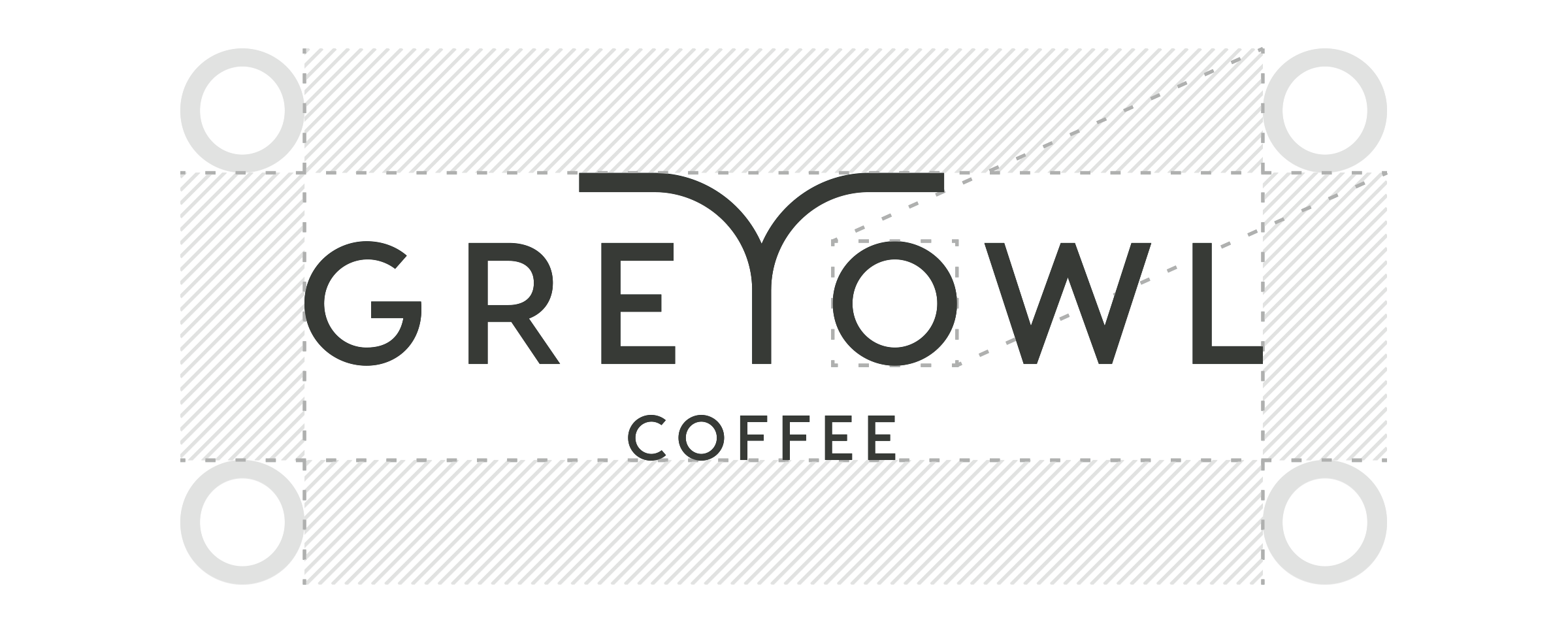
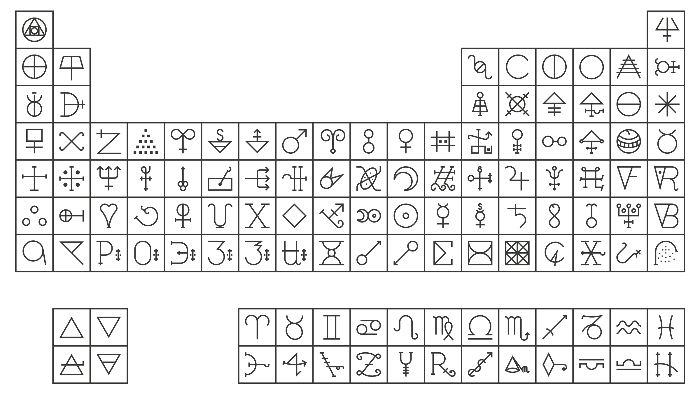
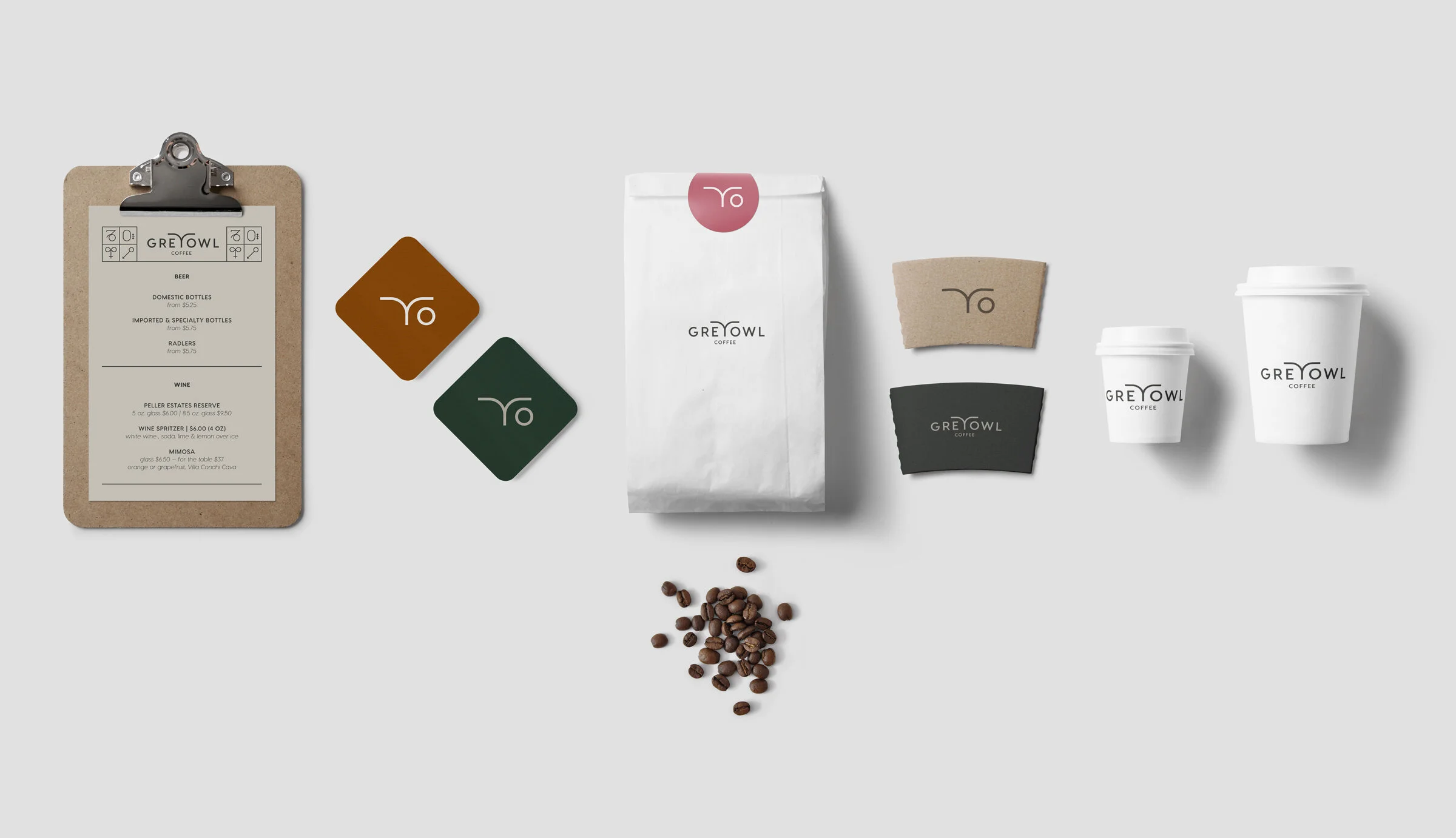
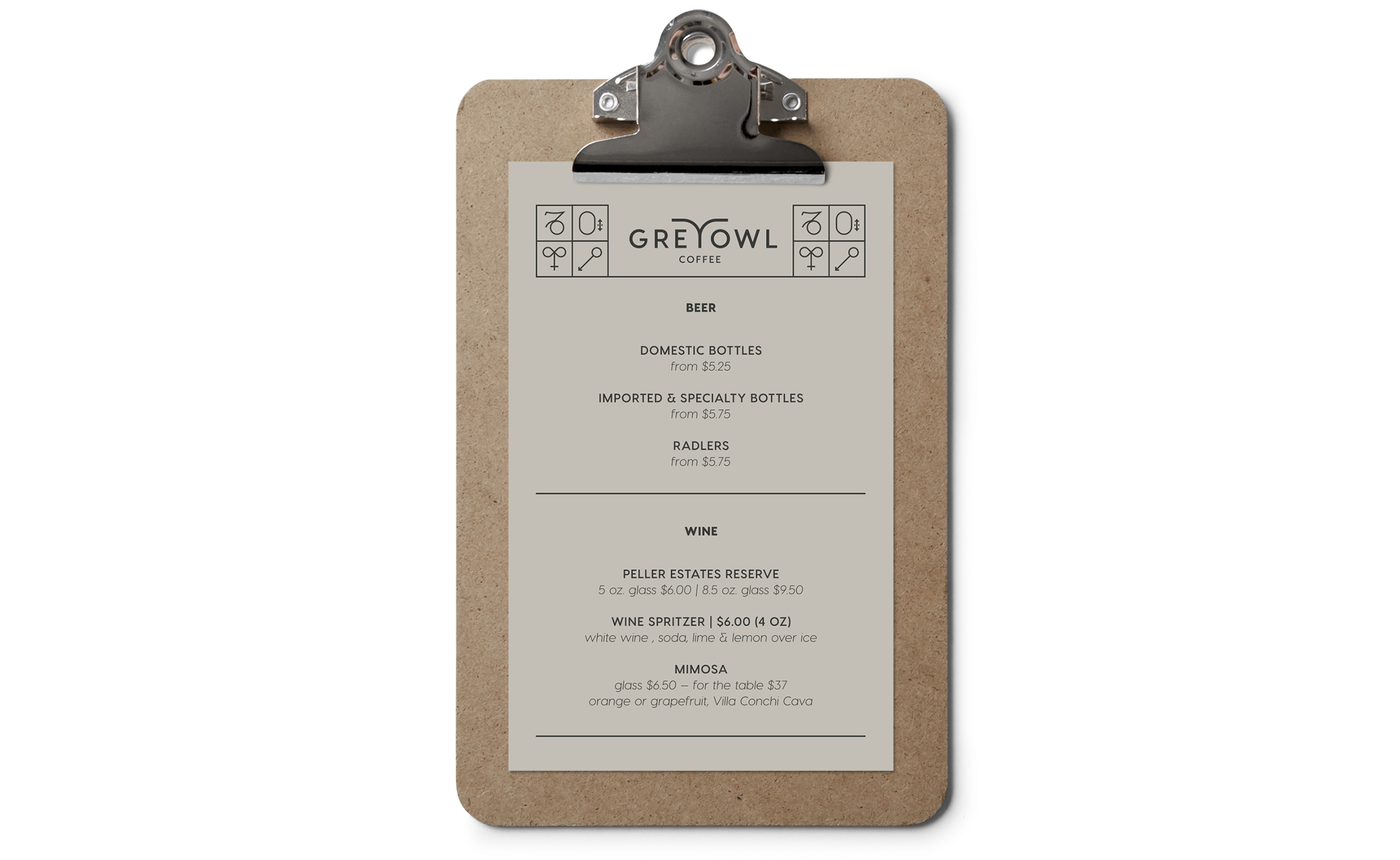
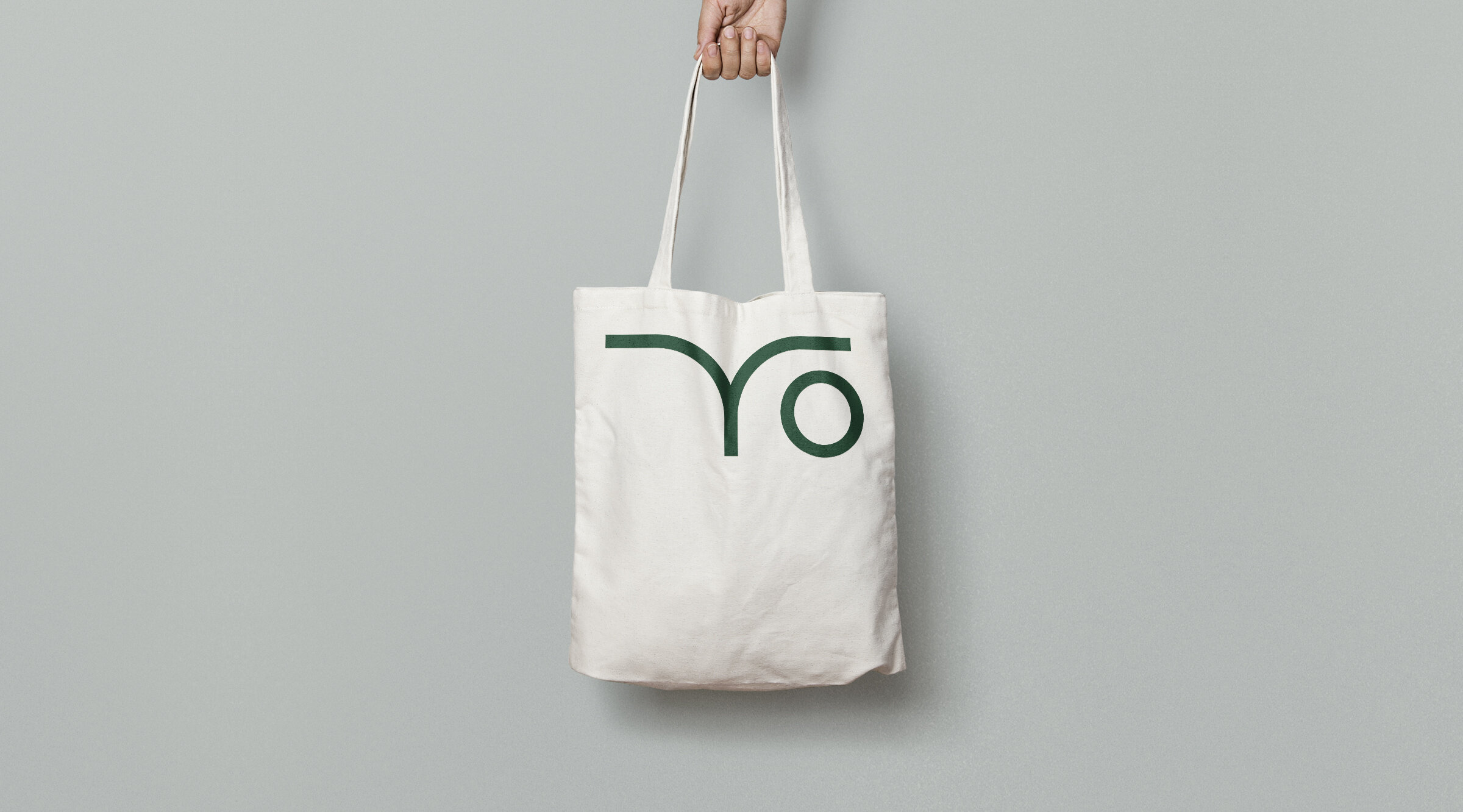
When a coffee connoisseur friend of a friend shared the exciting news of opening a new coffee shop, I couldn’t wait to get started on the brand. The idea was to zag where other local coffee shops had zigged. The atmosphere would be dark and cozy as opposed to bright and clean. We still wanted to speak a visual language that lent itself to third-wave coffee shops, but with a little more of a “public house” feel. With the name already determined, the visual motif easily followed—along with a wink and hints of alchemy.

 
grey-owl-brand-primary-logo.png
 

Primary logo mark

 
grey-owl-brand-safe-space.png

Safe area for primary logo mark

 
grey-owl-brand-secondary-logo-safety.png

Secondary logo mark and safe area

 
grey-owl-brand-primary-colour.png

Primary colour palette

 
grey-owl-brand-secondary-colour.png

Secondary colour palette

 
grey-owl-brand-patterning.png

Stylized Table of Alchemical Symbols—to be used for patterning and other playful forms of communications, such as menu ingredients

 
grey-owl-brand-stationery.jpg
grey-owl-brand-menu.png
grey-owl-brand-tote-mockup.jpg
 
grey-owl-brand-logo-final.png