Project
Palliser Furniture Brand Refresh
Project Owner
Palliser Furniture
Year
2018
Introduction
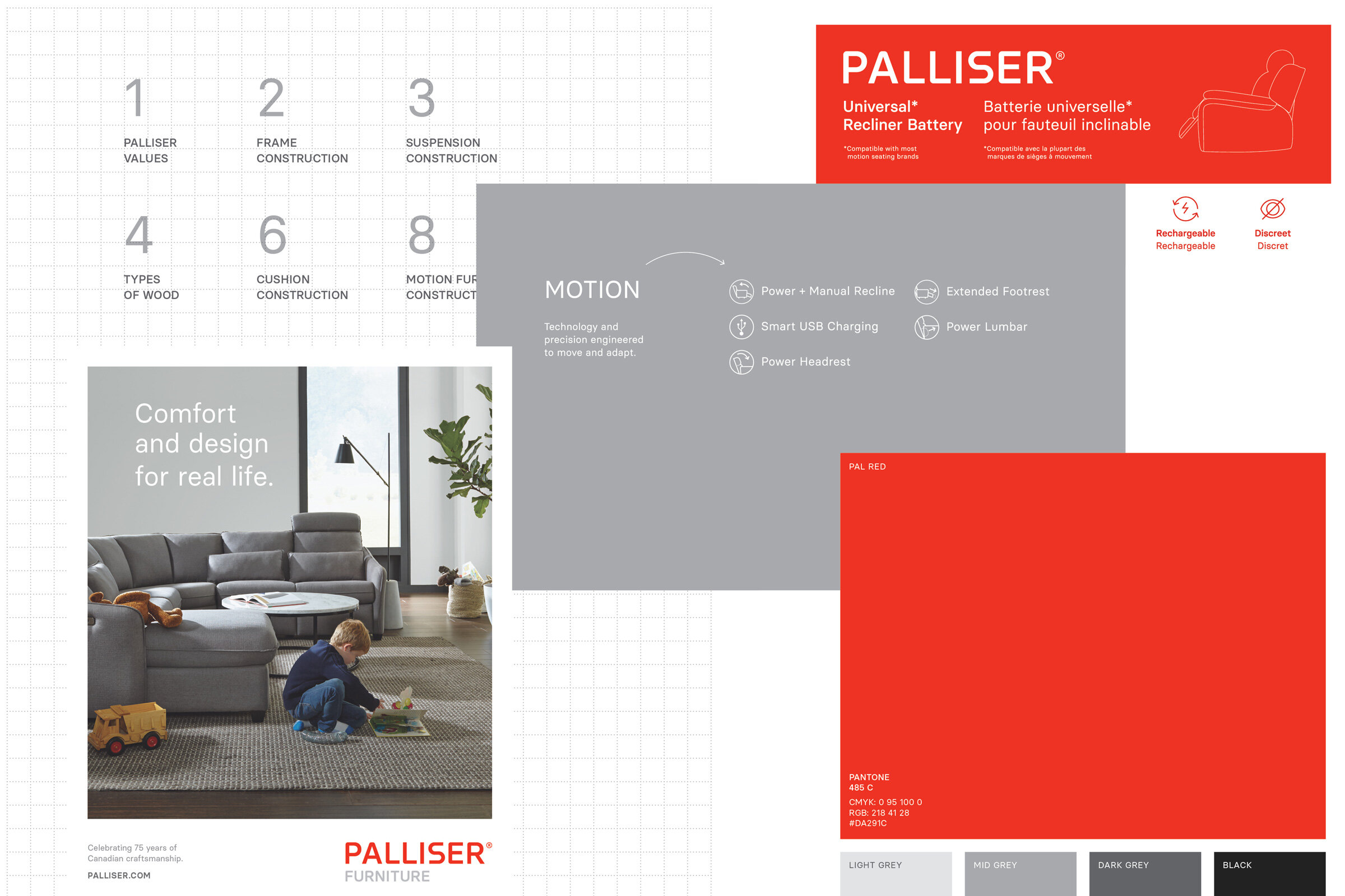
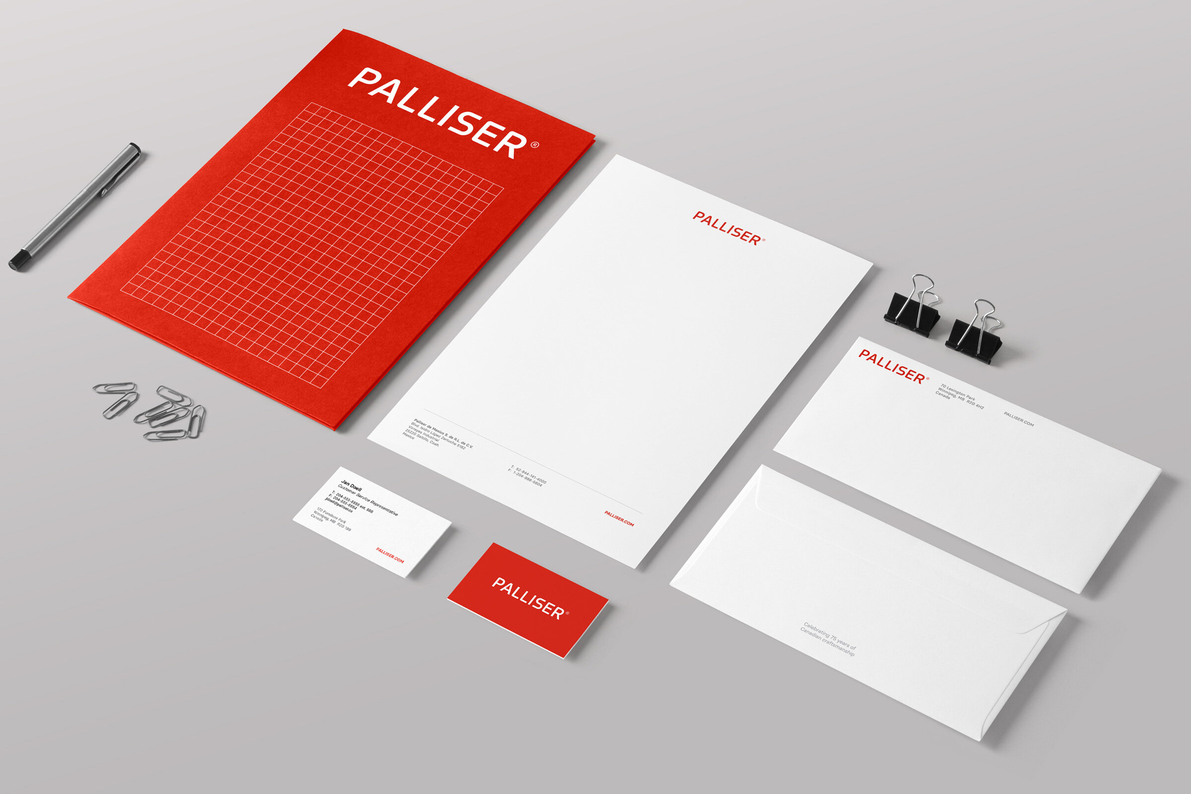
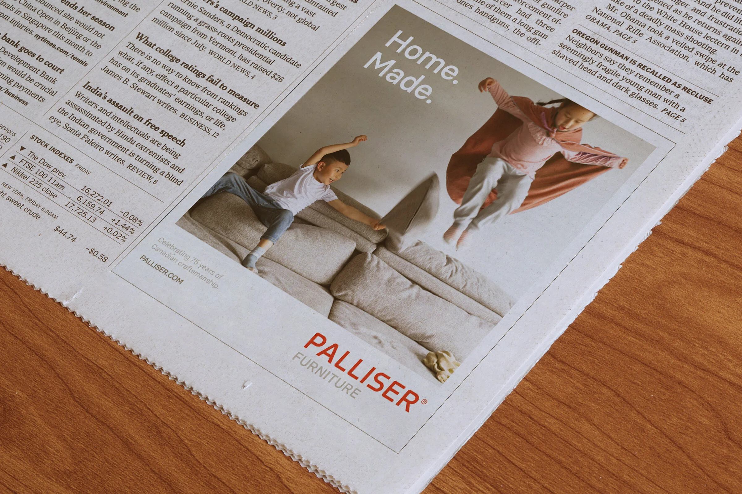
After delivering a brand refresh for Palliser (which included a logo update as well as other key brand assets), I joined the company as Art Director where I was given the unique opportunity to oversee the implementation. The goal of the refresh was to modernize the then nearly 75 year old company while still maintaining brand recognition. The company has earned a reputation as one of North America’s largest and most reliable furniture manufacturers.

Basier Circle was chosen as a starting point for the new logo mark. It was selected for its modernity as well as its neutrality. It was designed with logotypes, branding, and screen use in mind.
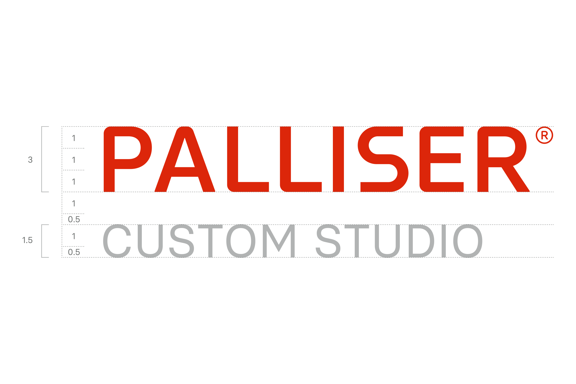
Refreshed primary logo mark
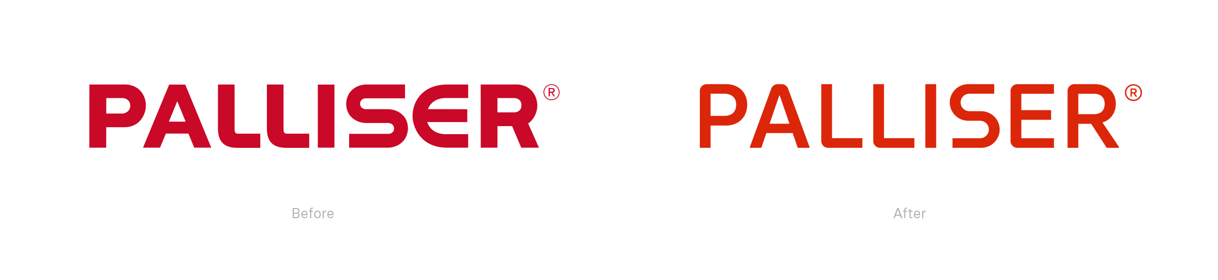
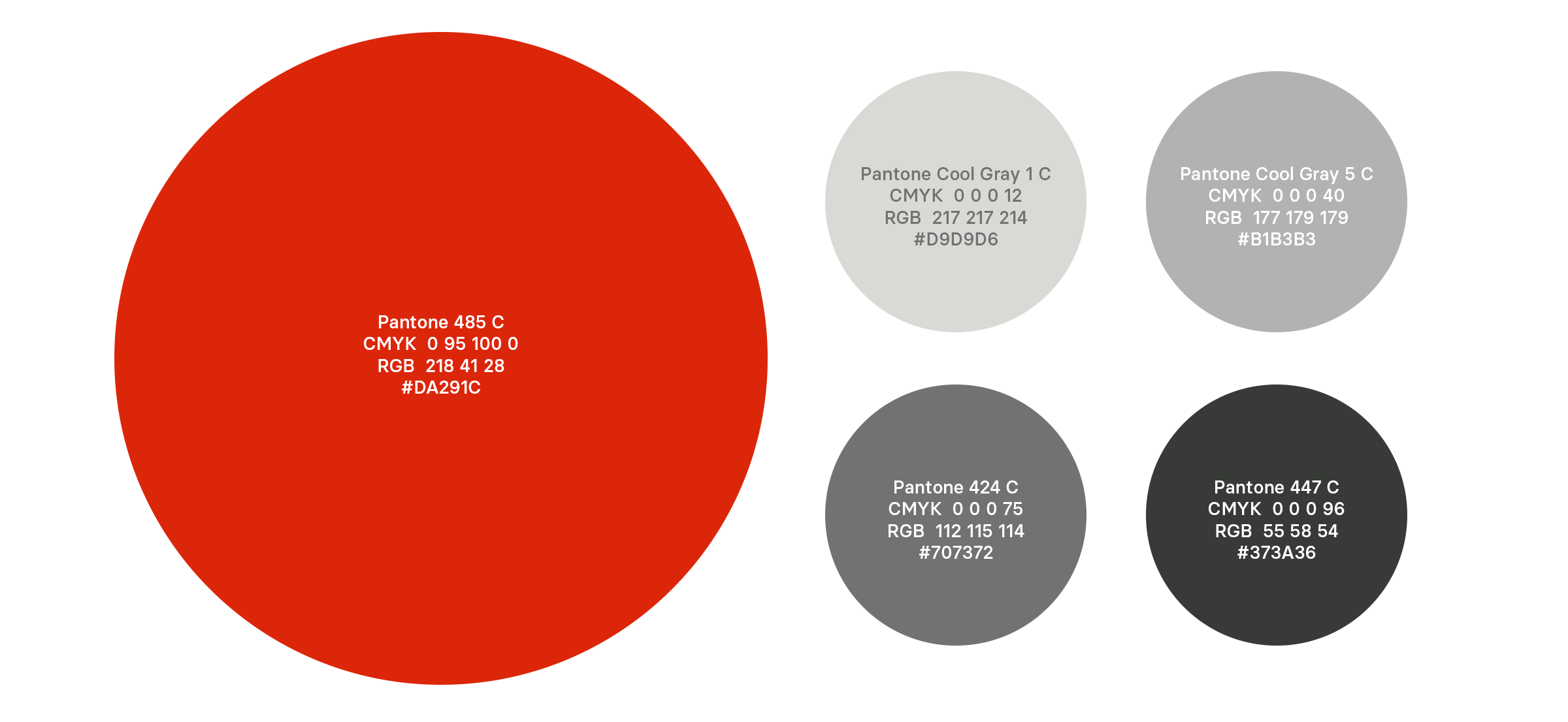
As intended, the change is slight but noticeable when compared side by side with the old logo. The new design is more slim, modern and consistent in its letter forms. A brighter, friendlier red was also introduced.